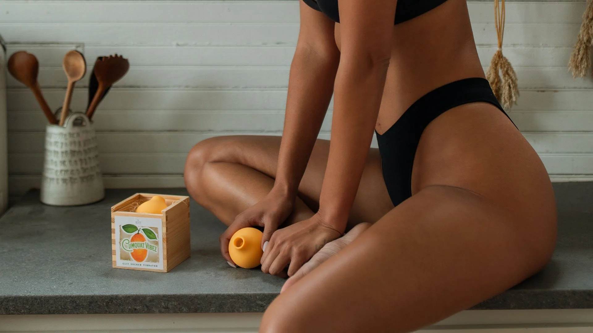
Cumquat Vibez //
packaging and LOGO DESIGN
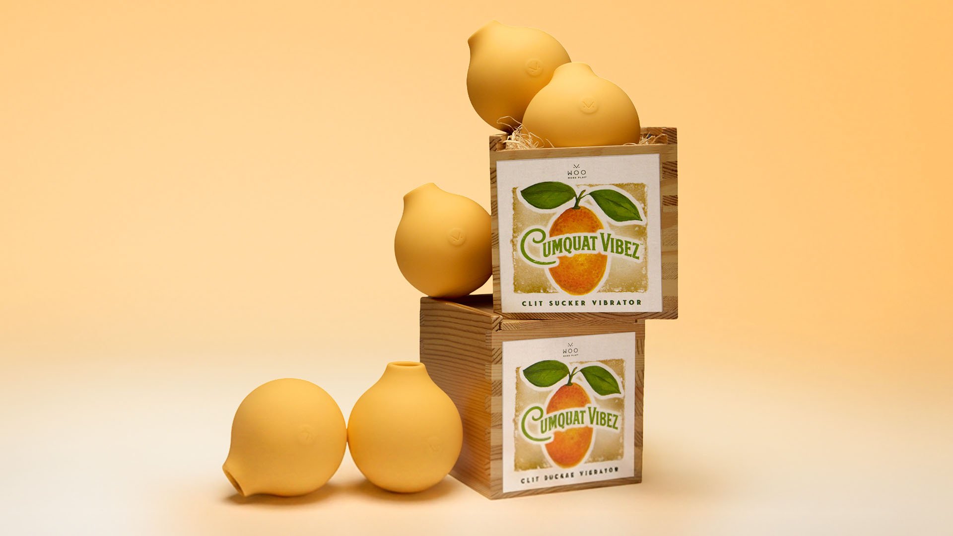
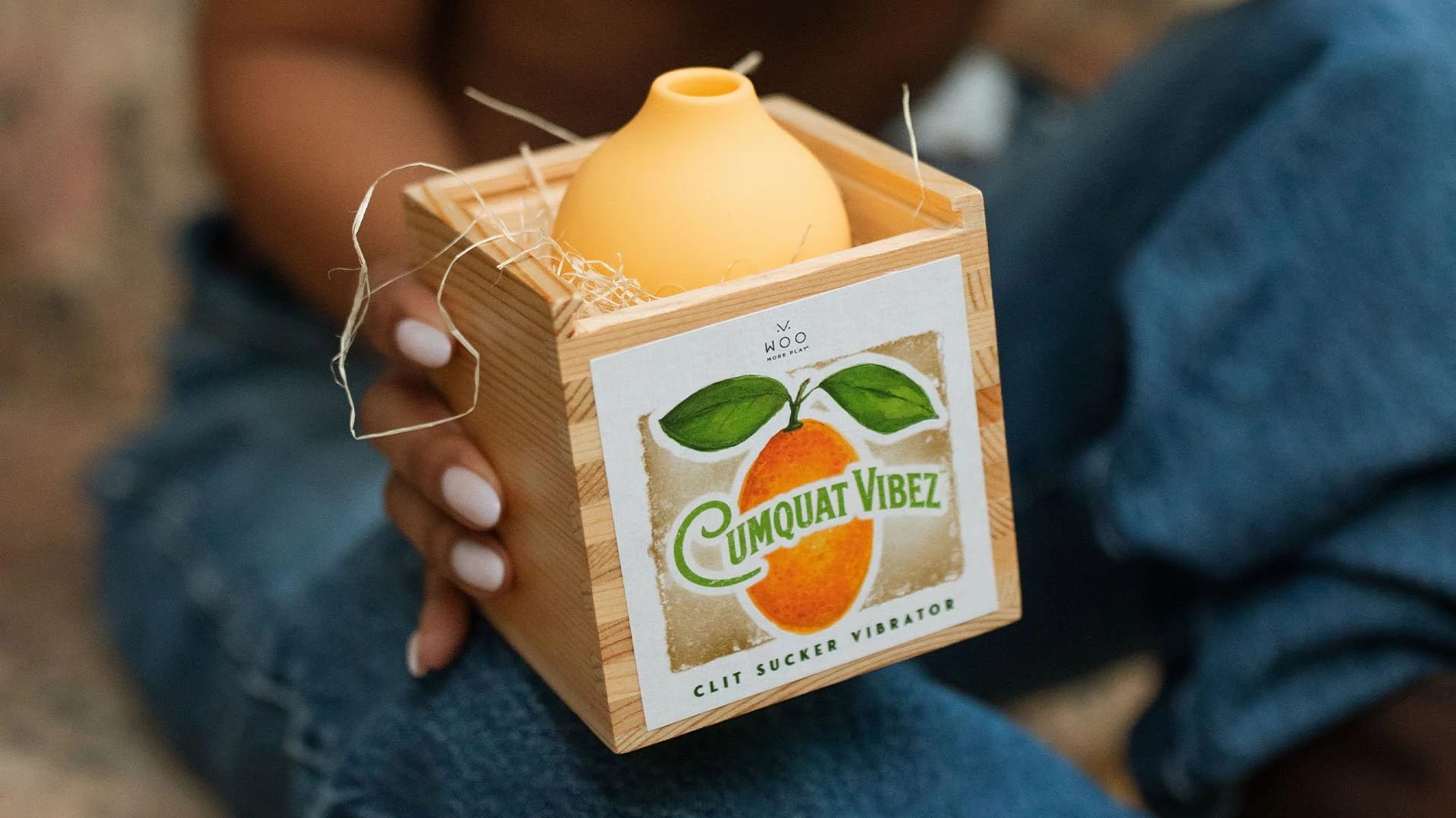
Logo and packaging design for WOO More Play’s newest vibrator, Cumquat Vibez. The launch of WOO More Play’s first suction vibrator kicks off ‘Sweet Summer Sex’ – a season defined by confidence, color, and pleasure without pressure. Cumquat Vibez is not a performance toy, but as a non-intimidating tool for solo pleasure. It is designed to feel approachable and worthy of living on your nightstand.
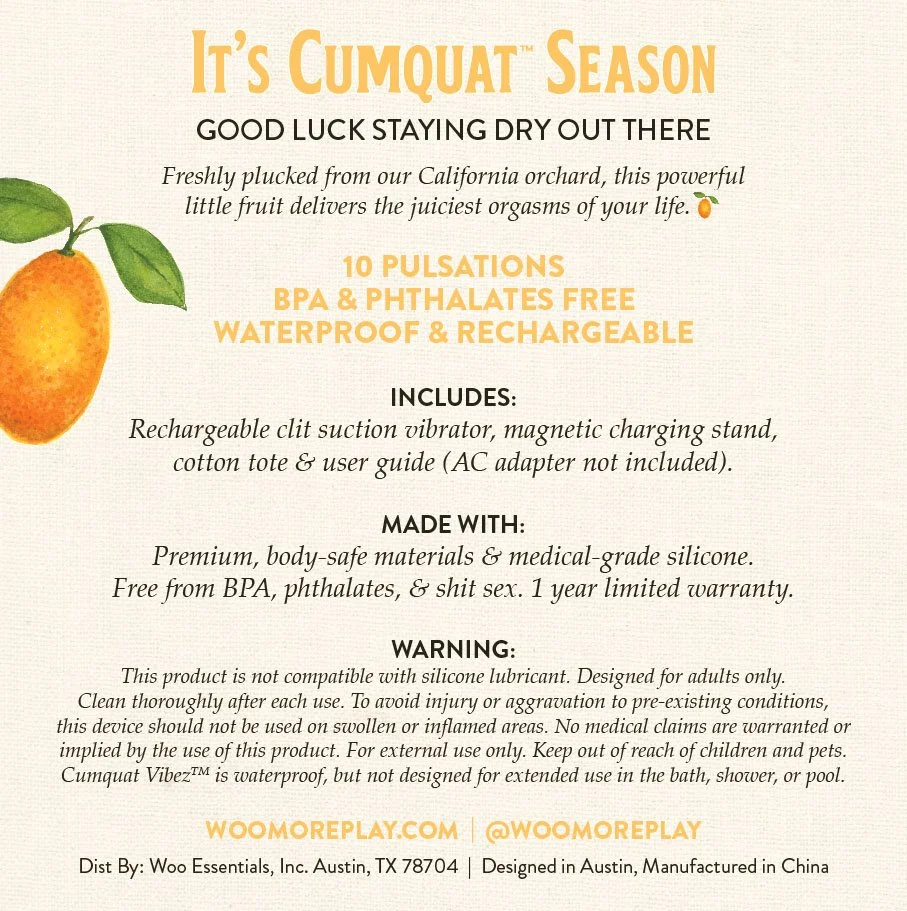
PACKAGING DESIGN //
The packaging is inspired by a sun-drenched summer filled with citrus orchards, a cool breeze and nowhere to be.
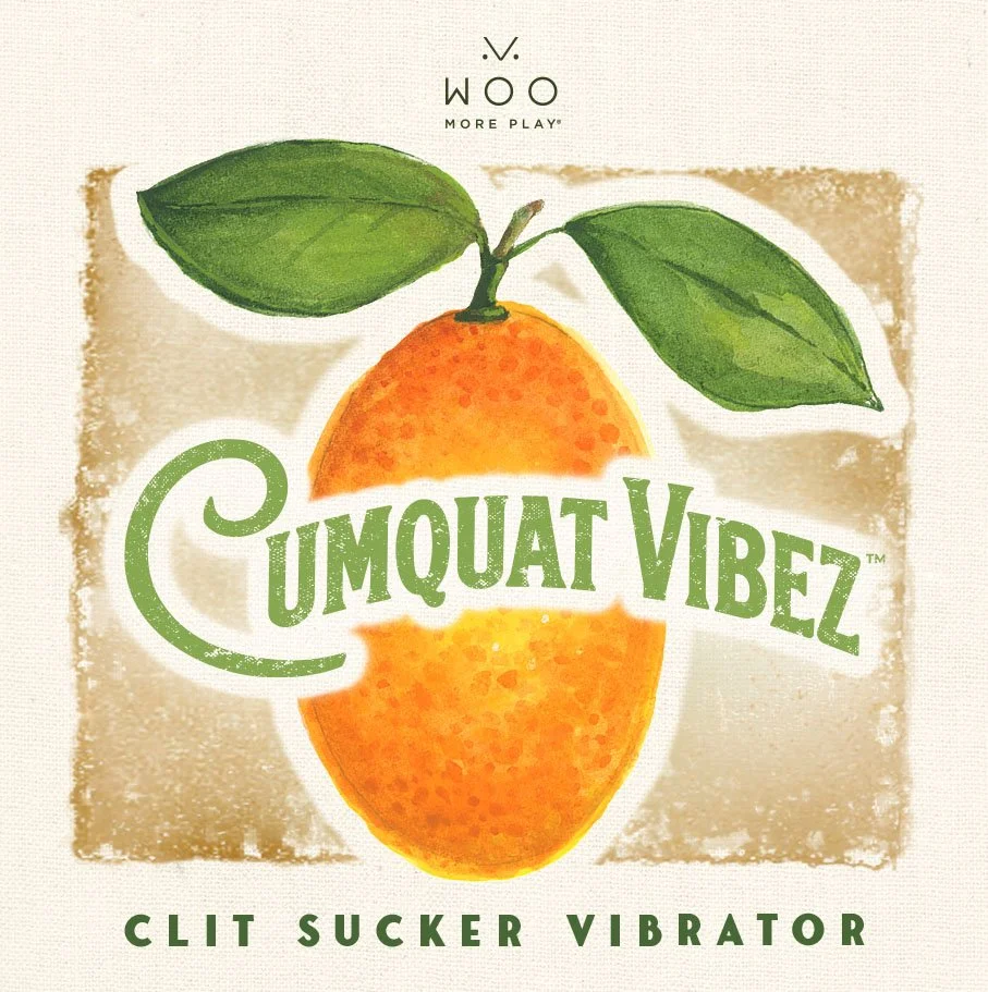
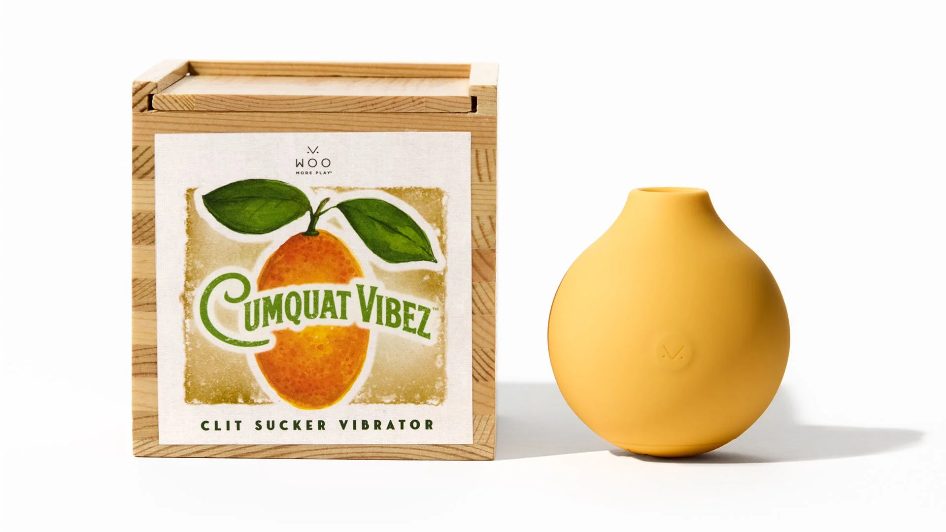
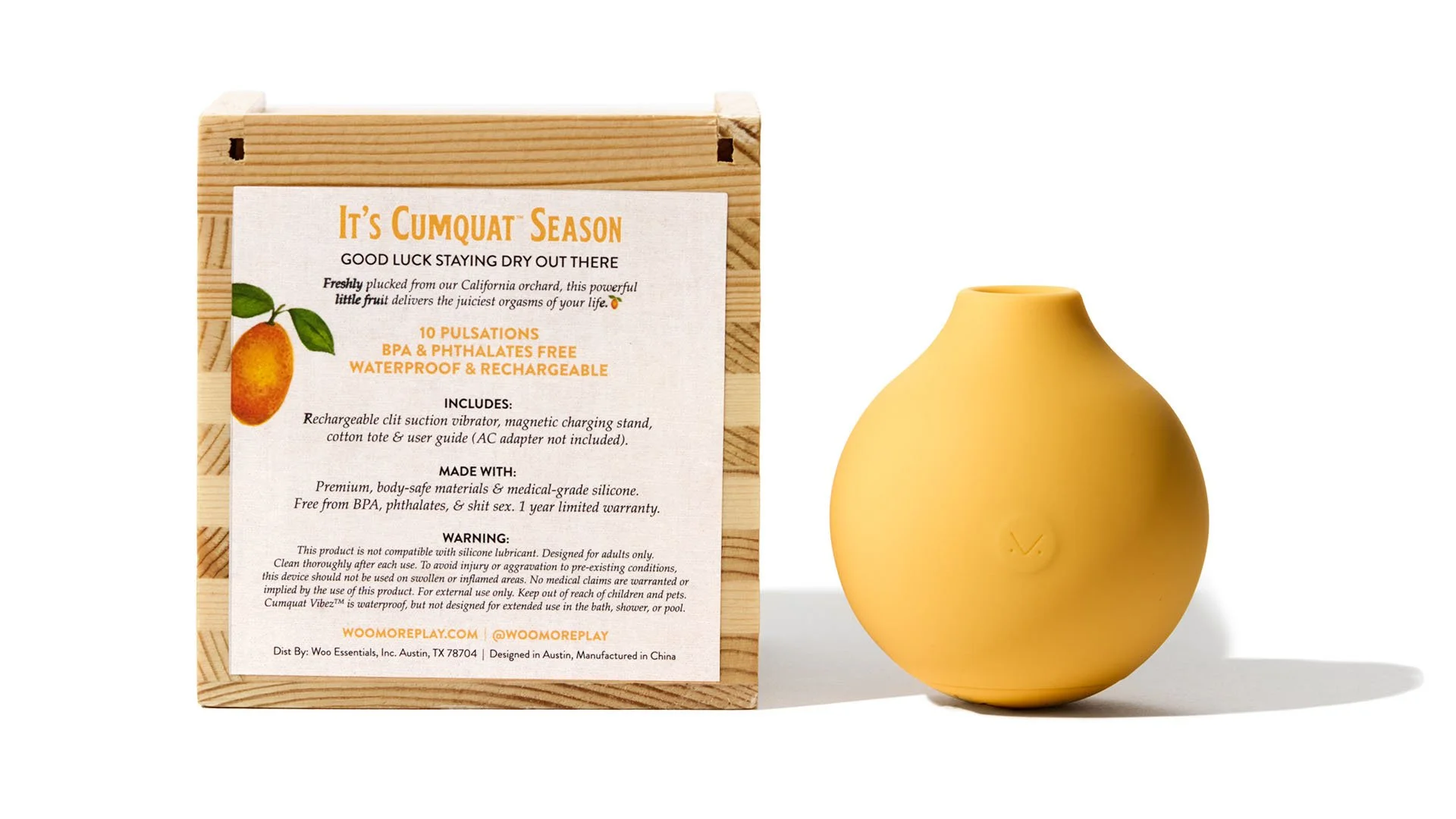
The packaging combines a watercolor illustration with a hand-drawn logo to create a playful, retro-inspired brand identity. The design emphasizes nostalgia, craftsmanship, and strong shelf presence.
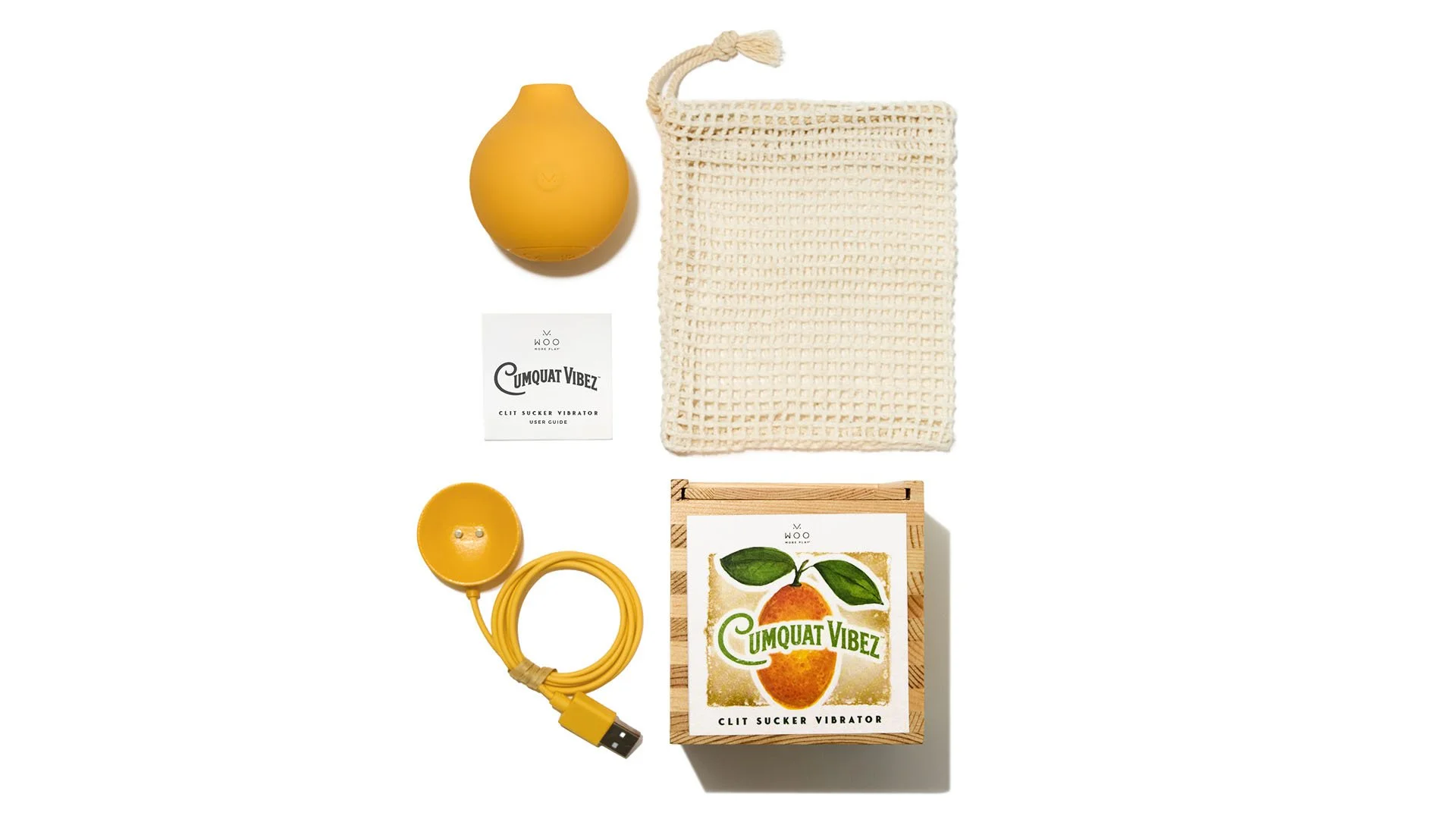
Delivered in a small wooden crate filled with soft hay, the packaging is reminiscent of a fresh fruit crate. Cumquat Vibez is playful, vibrant, and ready to be thoroughly enjoyed.
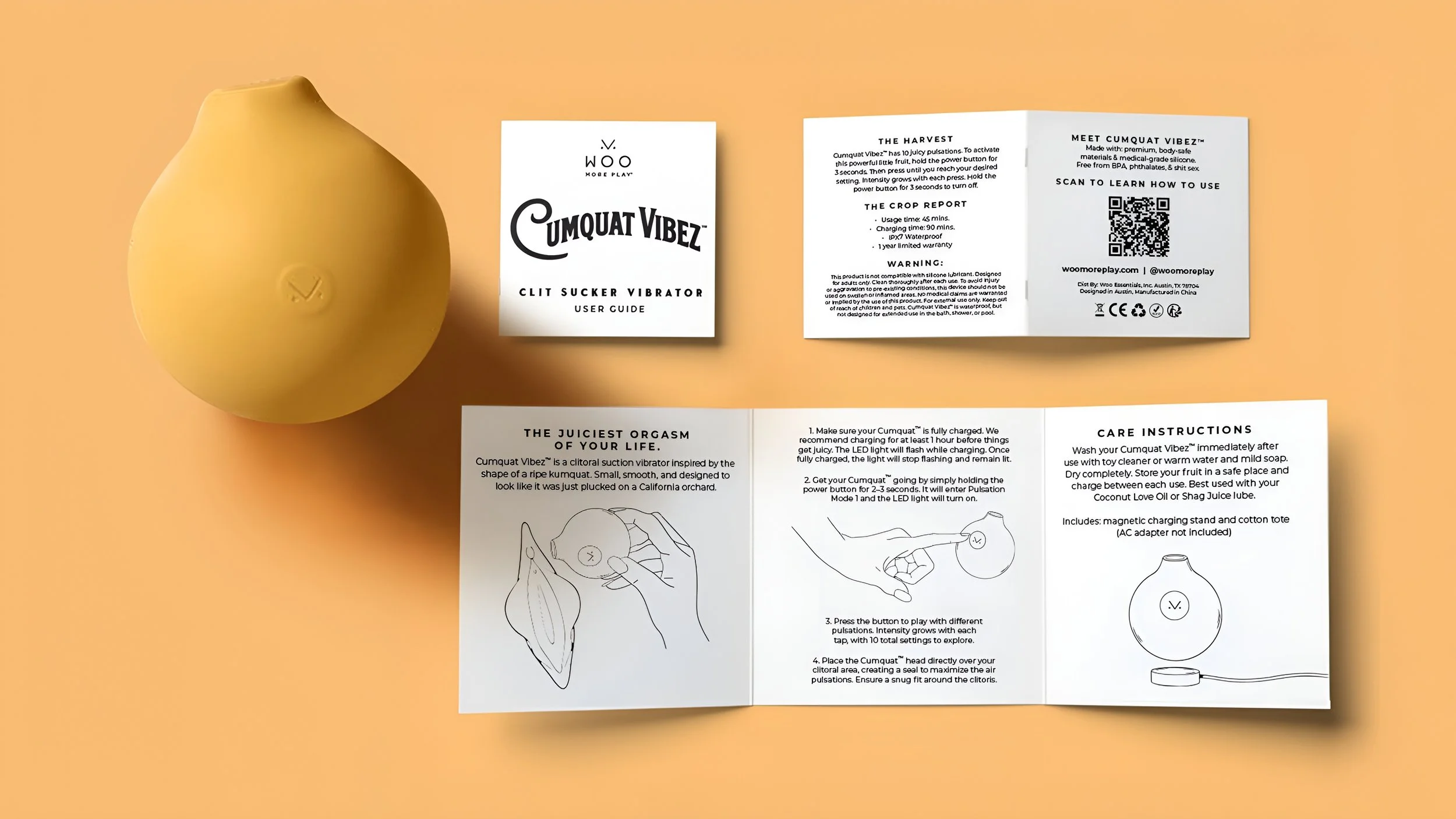
PAMPHLET ILLUSTRATIONS //
Designed as a compact trifold, this 2×2 user manual balances usability and brand storytelling through a clear and approachable design. Hand-drawn line illustrations, clean typography, and an intuitive panel layout create an engaging unboxing experience while making product setup and care easy to understand.
LOGO DESIGN //
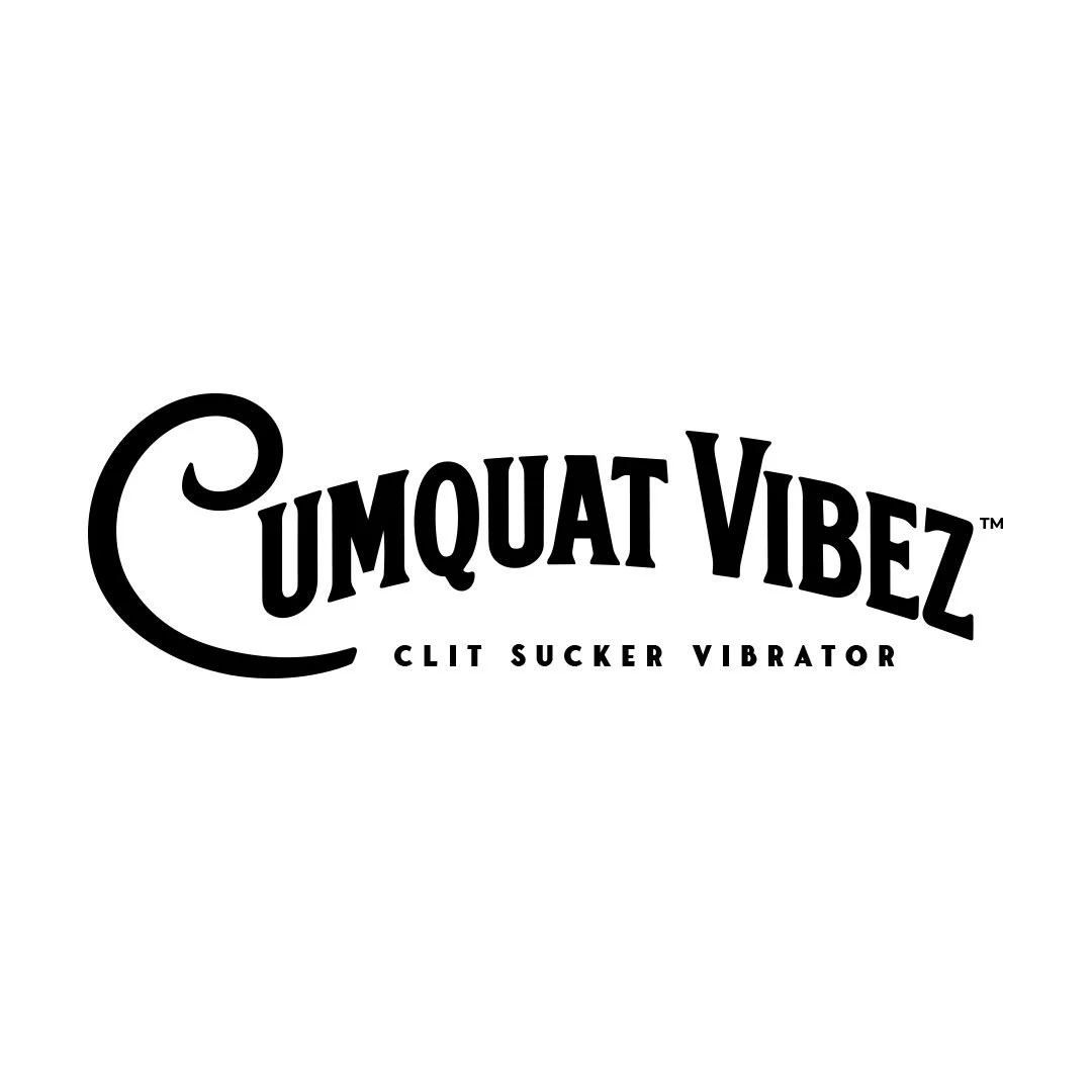
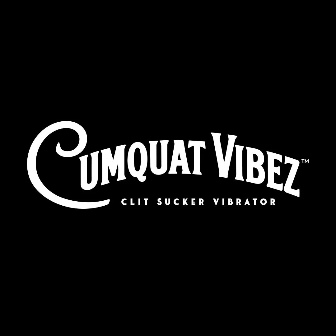
Inspired by vintage fruit packaging, Cumquat Vibez takes us back to an era of simpler times. The logo incorporates retro typography and playful curves to evoke nostalgia and quality.
LOGO EXPLORATION //
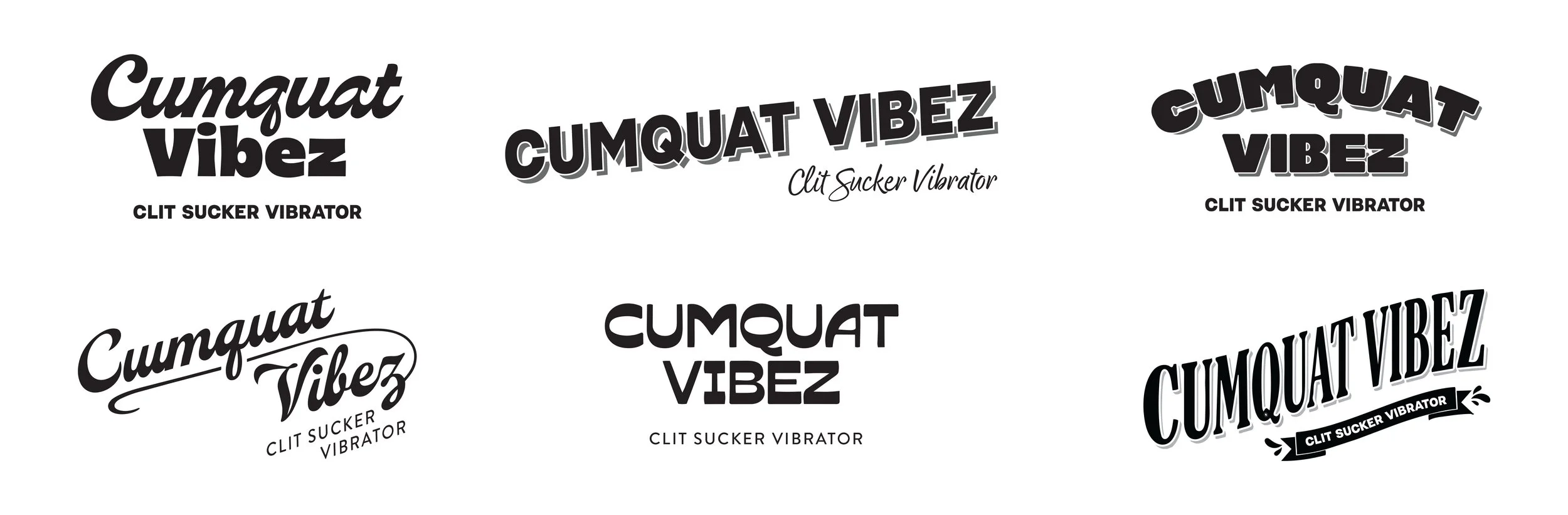
An exploration of vintage-inspired hand-drawn logo concepts, blending classic produce-market aesthetics with bold custom lettering.